
![]()
Treehouse has a bold mission: Ensure youth in foster care graduate high school at the same rate as their peers. See how Stoke is helping them to achieve it.
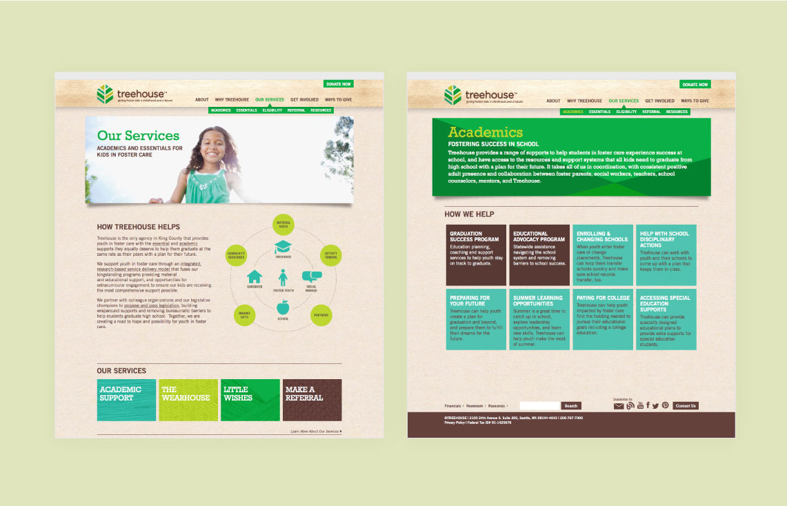
Treehouse is a leading nonprofit organization addressing the essential education and enrichment needs of kids in foster care. Treehouse assists 6,000 foster kids each year through programs that help them succeed in school, provide key material needs, and facilitate important experiences that every child deserves.
Treehouse was founded in 1988 by DSHS social workers, who saw the deprivation often faced by children in foster care. The organization provides clothes, toys, and school supplies, as well as access to critical extracurricular activities and community resources – bringing support to thousands of children in foster care each year.
In 2012, Treehouse decided to expand its mission beyond immediate material needs to address the alarmingly high dropout rate among high school students in foster care. The goal: Ensure foster youth in King County graduate high school at the same rate as their peers with a plan for their future.
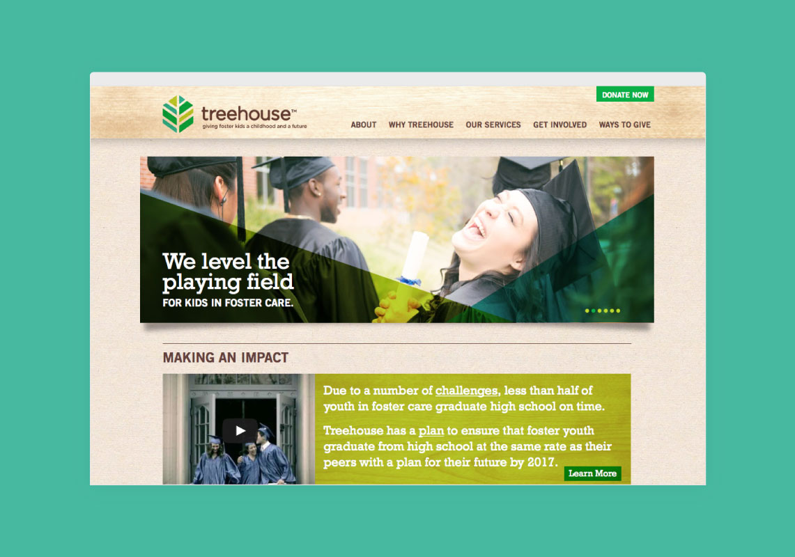
To achieve this ambition, Treehouse needed to create a strong brand identity while mitigating the stigma associated with “foster kids.” Through bold positioning, messaging and design, Treehouse aimed to create understanding and advocacy for foster youth by raising the stature of the system holistically, and measuring the impact of programs on education performance metrics – while also providing vital support and resources to help youth thrive in, and beyond, the foster care system.
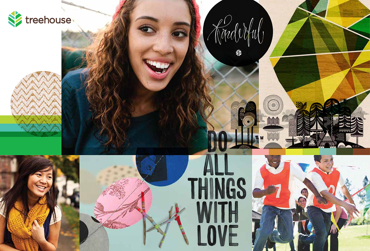
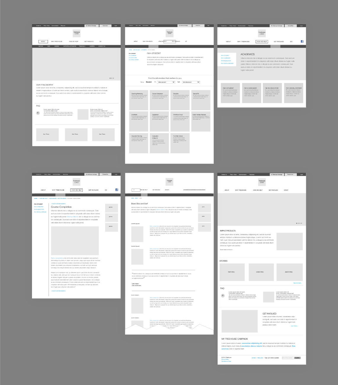
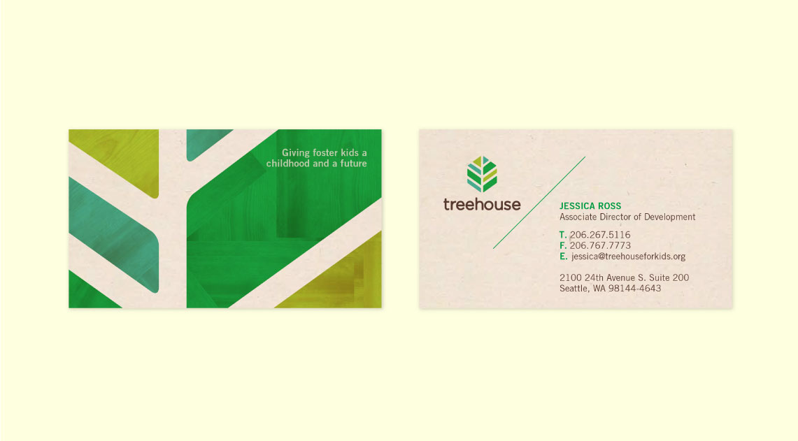
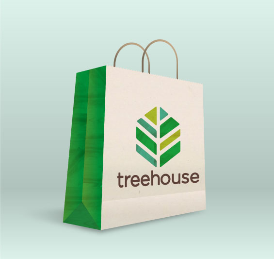
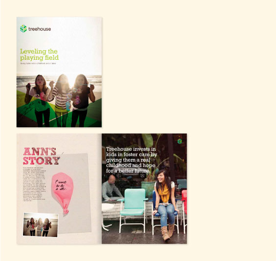
Stoke conducted internal and external research to uncover perceived strengths, weaknesses, challenges and opportunities. We then developed a brand position around the idea of “equity.” This was expressed through strong messaging that reinforced the organization’s commitment to “leveling the playing field” for youth in foster care by providing them the essential education, basic material needs and social experiences they equally deserve. The refreshed design and logo – a leaf-like, multi-colored symbol, which also looks like a 3D house – evokes ideas such as growth, protection, shelter and inclusiveness. The new brand was integrated across Treehouse’s digital and print materials and all communication platforms.


![]()
Research
Brand Strategy
Brand Design
Research
Brand Strategy
Brand Design
Research
Brand Strategy
Brand Design
206.297.8653
info@stokestrategy.com
114 NW Canal Street, #400
Seattle, WA 98107
©2026 Stoke Strategy All Rights Reserved
Subscribe to our email newsletter for updates, articles and our latest musings.